77 percent of American adults today own smartphones, and that’s not counting the quickly growing tablet market. And they don't want to just use this technology in their personal lives. It's extending to the workplace, too.
If your users want access to data, they need mobile-friendly dashboards.
Luckily, Sequel Data Acces makes it easy to take data on the road.
Not Using Sequel Yet? Try it Today >
If you're already using Sequel, here are our best tips and tricks for building better mobile dashboards.
What’s the Secret to Mobile Dashboards?
Your challenge when designing mobile dashboards is showing data in the best format for a mobile device or tablet.
An ideal mobile dashboard is vertical and allows users to scroll up and down to view the information.
When preparing to build a dashboard for mobile it’s important to know what to include and how to properly build the dashboard vertically with Sequel Viewpoint.
Ask the following questions before you build a dashboard.
- Who is the audience?
- What information do they really need to access?
- How much data needs to be included—with a smaller screen size, less can be more.
- Do users need a quick glance feature to view summarized data?
- Do you include or not include images?
- Do you need to include links or action buttons to bring up additional information?
Three Important Elements of Dashboard Design
1. Think Vertically
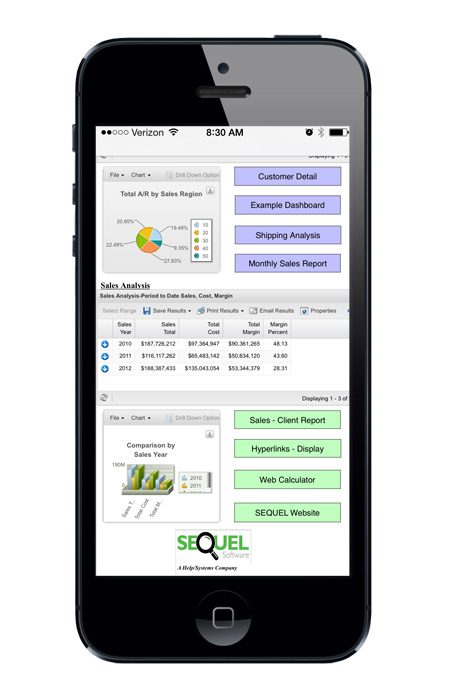
When designing, think of how objects will show on a smart phone (tall and narrow). It’s important to align objects in the dashboard in a vertical pattern (see figure 3).
2. Remember Less is More
Select the information that is needed—less information could be more in this instance. Display information that can, for sure, be viewed and analyzed from the mobile device.
3. Limit Images
Decide whether or not to limit (or omit) images. Keep in mind, images take up a lot of space and may not add any useful information.
How to Make Your Sequel Dashboards Mobile-Friendly
Here's an example of how to make your dashboards mobile-friendly.
We started with an original PC-specific Sequel dashboard. Our goal was to reformat this dashboard to display beautifully on a mobile device (e.g. iPad, iPhone, tablet), too.
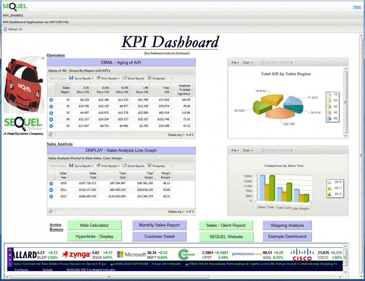
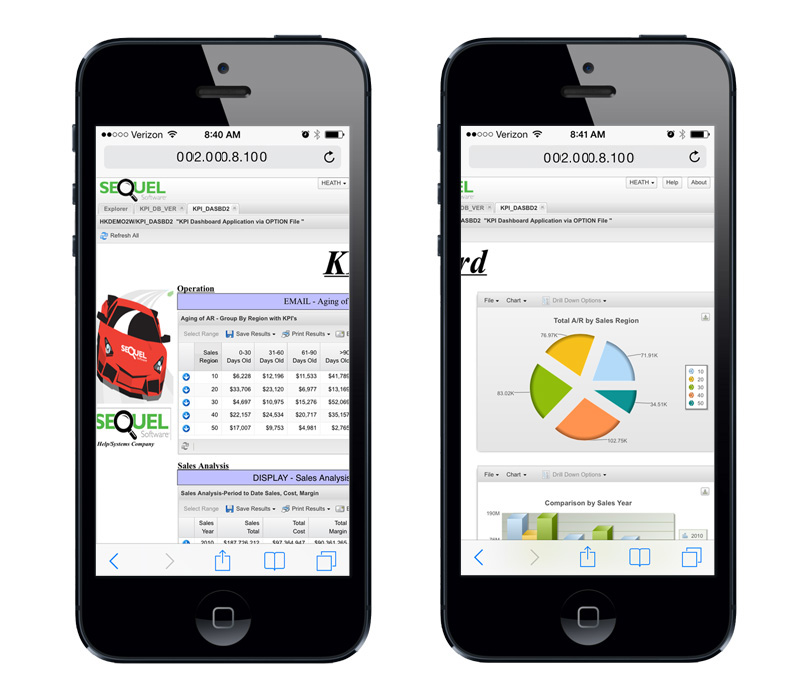
Without redesigning our dashboard, it wouldn’t display well on a mobile device. It requires that your user scroll not only up and down but also left and right, as well as needing to zoom to search for the information they need.
Here is what we changed to make our dashboard mobile-friendly:
- Removed the Sequel car image
- Aligned Operation and Sales analysis data along the left edge
- Stacked the supporting pie and bar charts
- Vertically stacked and aligned the action buttons
Note: As you bring down the objects in the dashboard a scroll bar will appear, allowing you to build a vertical, tall, long dashboard.
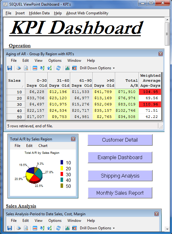
Once you are pleased with your dashboard, save it as an IBM i object. Now users can open that dashboard from a browser or mobile device using Sequel Web Interface as well as with a PC.
After easily redesigning your dashboard into a vertical layout, the user will be able to see the important information without zooming or scrolling from side to side.
Here's what our dashboard looks like now:
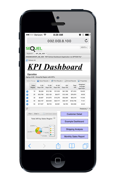
Building mobile dashboards can take some thinking at first, but once you determine the right information to include, you can quickly and easily modify your existing dashboards (or replicate and redesign them into mobile versions) for your current users.
Do More with Sequel
Build your dashboarding, reporting, and querying skills. Attend training and start getting more out of Sequel Data Access today.
