Like the fantastic characters in a Ripley’s museum, this article examines some fantastic results produced by performance experts. Come inside and see how to keep your response time constant under any load! After all, seeing is believing ... or is it?
As you might guess from the title, this article is about delusions; delusions that arise from incorrect interpretation of load test measurements.
Load testing (by which I mean any measurements taken on a computer system that is driven by a controlled workload) is the ultimate in performance simulation. It also offers countless opportunities for making systematic mistakes in the way the workloads are applied and the resulting measurements interpreted. Right test, wrong conclusion is a ubiquitous mistake that happens because test engineers tend to treat data as divine. Such reverence is not only misplaced, it’s also a sure ticket to production hell when the application finally goes live. In this article, I’ll discuss how such mistakes can be avoided by means of the following examples and war stories:
- Testing over the psychic hotline (in Section 3)
- HTTP demons in the works (in Section 4.2)
- Going flat with too much Java juice! (in Section 4.3)
- Threads that throttle (in Section 4.4)
In each case I will explain how simple performance models could have been applied to interpret the load test measurements correctly.
1. Load Testing Gotchas
Load testing can mean different things to different people. In many respects it is related to benchmarking in a controlled computing environment and that’s the sense I’m using here. Viewed that way, it is the ultimate in performance analysis (i.e., workload simulation). It is often made more difficult because it takes place in a competitive environment: be it vendors competing against each other publicly using the TPC , or SPEC benchmarks or a customer assessing vendor performance running their own application during the procurement cycle.
There are countless opportunities for making mistakes in the way the loads are constructed and applied. Everybody tends to focus on that aspect of designing and running benchmarks and load tests.
A far more significant problem-and one that everyone seems to be blissfully unaware of-is interpreting benchmark data correctly. Right test, wrong conclusion is a much more common blunder than many of us realize. I submit that this happens because test engineers tend to treat performance data as divine. The huge cost and effort required to set up a benchmark system can lead us all into the false security that the more complex the system, the more sacrosanct it is. As a consequence, whatever data it generates must be correct by design and to even suspect otherwise is sacrilegious. Such reverence for performance test data is not only misplaced, it often guarantees a free trip to hell when the application finally goes live.
In the following, I will show you by example how such measurement blunders can arise and, more importantly, how they can be avoided with simple performance models that provide a correct conceptual framework in which to interpret the data.
2. Canonical Curves
In the subsequent discussion, I shall refer to some canonical performance characteristics that occur in all benchmark measurements.
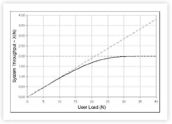
Fig.1 shows the canonical system throughput characteristic X (the dark curve). This is the kind of curve that would be generated by taking the average of throughput measurements in steady state at successive client load points N [Joines et al. 2002].
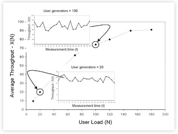
Figure 2: Relationship between steady-state measurements of the instantaneous throughput X(t) (insets) and the time-averaged throughput X(N) (dots).
The dashed lines in Figure 2 represent bounds on the throughput characteristic. The horizontal dashed line is the ceiling on the achievable throughput Xmax. This ceiling is controlled by the bottleneck resource in the system; which also has the longest service time Smax. The variables are related inversely by the formula:

which tells us that the bigger the bottleneck, the lower the maximum throughput; which is why we worry about bottlenecks. The point on the N-axis where the two bounding lines intersect is a first order indicator of optimal load Nopt. In this case, Nopt = 21 virtual users or load generators.
The sloping dashed line shows the best case throughput if their were no contention for resources in the system-it represents equal bang for the buck-an ideal case that cannot be achieved in reality.
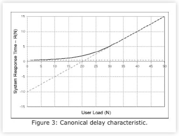
Similarly, Fig. 3 shows the canonical system response time characteristic R (the dark curve). This shape is often referred to as the response hockey stick. It is the kind of curve that would be generated by taking time-averaged delay measurements in steady state at successive client loads.
The dashed lines also represent bounds on the response time characteristic. The horizontal dashed line is the floor of the achievable response time Rmin. It represents the shortest possible time for a request to get though the system in the absence of any contention. The sloping dashed line shows the worst case response time once saturation has set in. You can think of these curves as simple performance models.
In passing, I note that representations of throughput X(N) and response time R(N) can be combined into a single plot like Fig. 4 [Splaine 2001].
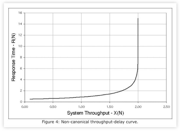
Although useful in some contexts, the combined plot suffers from the limitation of not being able to calculate the location of Nopt.
3. Testing Over the Psychic Hotline
3.1 Background
Dateline: Miami Florida, sometime in the murky past. Names and numbers have been changed to protect the guilty. I was based in San Jose. All communications occurred over the phone. I never went to Florida and I never saw the benchmark platform.
Over the prior 18 months, a large benchmarking rig had been set up to test the functionality and performance of some third party software. Using this platform, the test engineers had consistently measured a system throughput of around 300 TPS (transactions per second) with an average think time of 10 s between sequential transaction requests. Moreover, during the course of development, the test engineers had managed to have the application instrumented so they could see where time was being spent internally when the application was running. This is a good thing and a precious rarity!
3.2 Benchmark Results
The instrumented application had logged internal processing times. In the subsequent discussion we’ll suppose that there were three sequential processing stages. Actually, there were many more. Enquiring about typical processing times reported by this instrumentation, I was given a list of average values which I shall represent by the three token values: 3.5,5.0, and 2.0 ms. At that point I responded, ``Something is rotten in Denmark ... err .... Florida!’’
3.3 The Psychic Insight
So, this is our first unbelievable load testing result. I know from the application instrumentation data that the bottleneck process has a service time of Smax = 0.005 s and applying the bounds analysis of Sect. 2 I know:
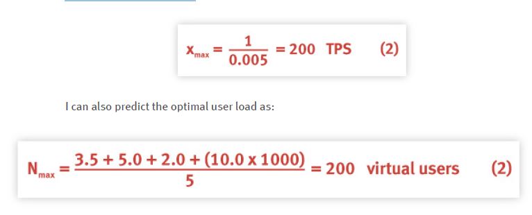
where I have replaced the 10 s think time by 10,000 ms. But the same data led the Florida test engineers to claim 300 TPS as their maximum throughput performance. From this information I can hypothesize that either:
- the load test measurement of 300 TPS is wrong or,
- the instrumentation data are wrong.
Once this inconsistency was pointed out to them, the test engineers decided to thoroughly review their measurement methodology 1. We got off the phone with the agreement that we would resume the discussion the following day. During the night the other shoe dropped.
The client scripts contained an if ( ) statement to calculate the instantaneous think time between each transaction in such a way that its statistical mean would be 10 s. The engineers discovered that this code was not being executed correctly and the think time was effectively zero seconds.
In essence, it was as though the transaction measured at the client Xclient was comprised of two contributions:

such that Xactual = 200 TPS and Xerrors = 100 TPS (except these weren’t bona fide transactions). In other words, the test platform was being overdriven in batch mode (zero think time) where the unduly high intensity of arrivals caused the software to fail to complete some transactions correctly. Nonetheless, the application returned an ACK to the load test driver which then scored it as a correctly completed transaction. So, the instrumentation data were correct but the load test measurements were wrong. This led to a performance claim for the throughput that was only in error by 50%!
Even after 18 months hard labor, the test engineers remained blissfully unaware of this margin of error because they were not in possession of the simple performance models presented in Sect. 2. Once they were apprised of the inconsistency, however, they were very quick to assess and correct the problem 2. The engineers in Florida did all the work, I just thought about it. Dionne Warwick and her Psychic Friends Network would’ve been proud of me.
4. Falling Flat on Java Juice!
4.1 Background
The following examples do not come directly from my own experience but rather have been chosen from various books and reports. They represent a kind of disturbing syndrome that, once again, can only arise when those producing the test data do not have the correct conceptual framework within which to interpret it.
4.2 Demonized Performance Measurements
The load test measurements in Table 1 were made on a variety of HTTP demons [McGrath and Yeager 1996].
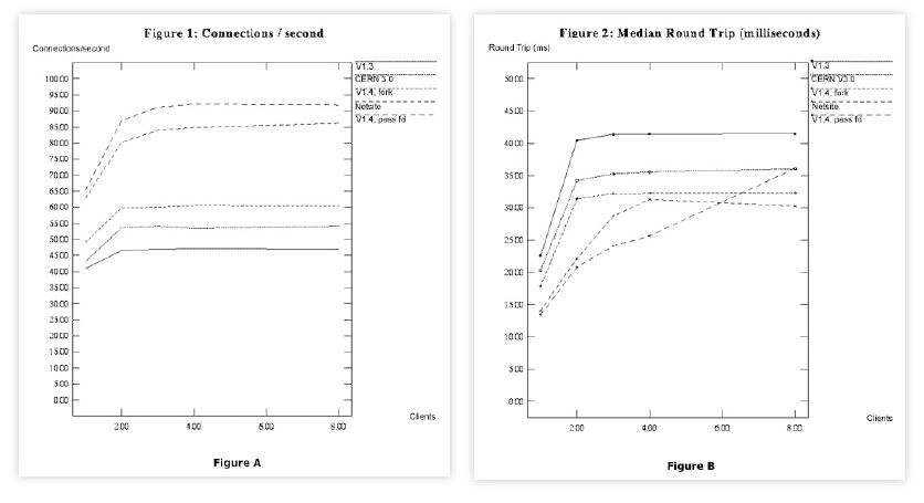
Table 1: Figure A shows the measured throughput data in connections per second for a suite of five HTTPd servers. Figure B shows the measured response times in milliseconds.
Each curve roughly exhibits the expected throughput characteristic as described in Sect. 2. The slightly odd feature, in this case, is the fact that the servers under test appear to saturate rapidly for user loads between 2 and 4 clients. Turning to Table 1, we see similar features in those the curves.
Except for the bottom curve, the other four curves appear to saturate between N = 2 and 4 client generators. Beyond the knee one dashed curve even exhibits retrograde behavior; something that would take us too far afield to discuss here. The interested reader should see [Gunther 2000] Chap. 6.
But these are supposed to be response time characteristics, not throughput characteristics. According to Sect. 2 this should never happen! This is our second unbelievable load test result. These data defy the laws of queueing theory [Gunther 2000][Chap. 2, 3]. Above saturation, the response time curves should start to climb up a hockey stick handle with a slope determined by the bottleneck service time Smax. But this is not an isolated mistake.
4.3 Java Juiced Scalability
In their book on Java performance analysis, [Wilson and J. Kesselman 2000]pp. 6-7] refer to the classic convex response time characteristic previously discussed in Fig. 3 of Sect. 2 as being undesirable for good scalability. I quote ...
(Figure A in Table 2) ``isn’t scaling well’’ because response time is increasing ``exponentially’’ with increasing user load.
They define scalability rather narrowly as ``the study of how systems perform under heavy loads.’’ This is not necessarily so. As I have just shown in Sect. 4.2, saturation may set in with just a few active users. Their conclusion is apparently keyed off the incorrect statement that the response time is increasing ``exponentially’’ with increasing user load. No other evidence is provided to support this claim.
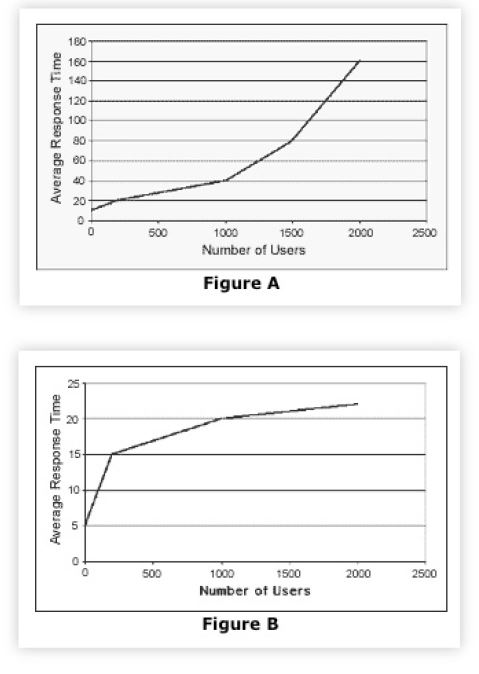
Table 2: Characteristic Java response time scalability. Yes, these plots are supposed to be exhibiting undesirable response times (Figure A) and desirable response times (Figure B). Note the similarity to Figure B in Table 1
Not only is the response time not rising exponentially, the application may be scaling as well as it can on that platform. We know from Sect. 2, that saturation is to be expected and growth above saturation is linear, not exponential. Moreover, such behavior does not, by itself, imply poor scalability. Indeed, the response time curve may even rise super-linearly in the presence of thrashing effects but this special case is not discussed either.
These authors then go on to claim that a response time characteristic of the type shown in Fig. 1 is more desirable.
(Figure B in Table 2) ``scales in a more desirable manner’’ because response time degradation is more gradual with increasing user load.
Assuming these authors did not mislabel their own plots (and their text indicates that they did not), they have failed to comprehend that the flattening effect is a signal that something is wrong. Whatever the precise cause, this snapping of the hockey stick handle should be interpreted as a need to scrutinize their measurements, rather than hold them up as a gold standard for scalability. As the famous physicist Wolfgang Pauli once retorted, ``This analysis is so bad, it’s not even wrong!’’
4.4 Threads That Throttle
The right approach to analyzing sublinear response times has been presented by [Buch and Pentkovski 2000].
The context for their measurements is a three-tier e-business application comprising:
- Web services
- Application services
- Database backend
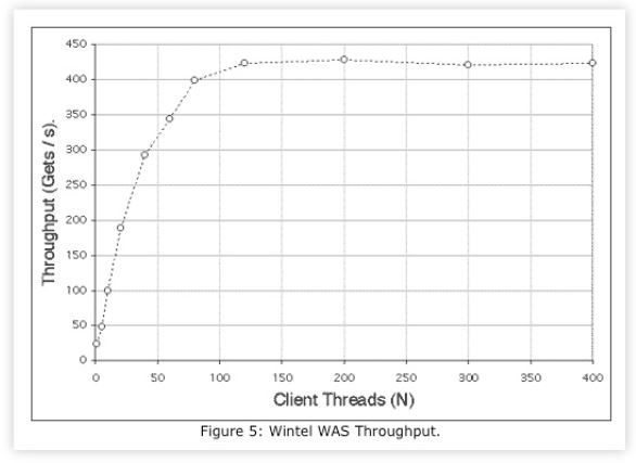
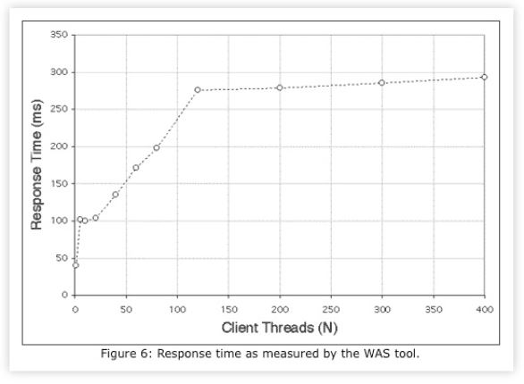
and using Microsoft’s Web Application Stress (WAS) tool as the test harness. The measured throughput in Fig. 5 exhibits saturation in the range 100 < Nwas < 150 clients. The corresponding response time data in Fig. 6 exhibits sublinear behavior of the type discussed in Sects. 4.2 and 4.3.
In Table 3, Nwas is the number of client threads that are assumed to be running. The number of threads that are actually executing can be determined from the WAS data using Little’s law [Gunther 2004] in the form Nrun = Xwas ×Rwas where the response time (Rwas) is expressed in units of Seconds.
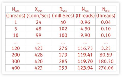
Table 3: Summary of load test measurements using the Microsoft Web Application Stress tool.
We see immediately in the fourth column of Table 3 that no more than 120 threads (shown in bold) are ever actually running (Fig. 7) on the client CPU even though up to 400 client processes have been initiated.
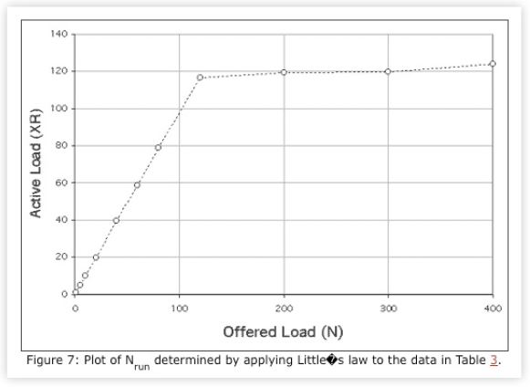
In fact, there are Nidle = Nwas - Nrun threads that remain idle in the pool.
This throttling by the size of the client thread pool shows up in the response data of Fig. 6 and also accounts for the sublinearity discussed in Sects. 4.2 and 4.3. The complete analysis of this and similar results are presented in [Gunther 2004]. Because the other authors were apparently unaware of the major performance model expressed in Little’s law, they failed to realize that their load test was broken.
5. Summary
Performance data is not divine, even in a tightly controlled benchmark environment. Misinterpreting performance measurements is a common source of problems-some of which may not appear until the application has been deployed. One needs a conceptual framework within which to interpret all performance measurements. I have attempted to demonstrate by example how simple performance models can fulfill this role. These models provide a way of expressing our performance expectations. In each of the cited cases, it is noteworthy that when the data did not meet the expectations set by its respective performance model, it was not the model that needed to be corrected but the data. The corollary, having some expectations is better than having no expectations, follows immediately.
References
D. K. Buch and V. M. Pentkovski, ``Experience in Characterization of Typical Multi-tier e-Business Systems Using Operational Analysis,’’ p. 671-681, Proc. CMG Conference, Anaheim, CA, December 2-7, 2001
Neil Gunther, The Practical Performance Analyst, iUniverse Inc., Lincoln, NE, 2000
Neil Gunther, Analyzing Computer System Performance with Perl::PDQ, Springer-Verlag, Heidelberg, Germany, 2004 (In press)
S. Joines and R. Willenborg and K. Hygh, Performance Analysis for Java Web Sites, AddisonWesley, Boston, MA, 2002
Robert E. McGrath and Nancy J. Yeager, Web Server Technology: The Advanced Guide for WorldWide Web Information Providers, Morgan Kaufmann, San Francisco, CA, 1996
S. Splaine and S. P. Jaskiel, The Web Testing Handbook,STQE Publishing, Inc., Orange Park, FL, 2001
S. Wilson and J. Kesselman, Java Platform Performance: Strategies and Tactics, SunSoft Press, Indianapolis, IN, 2000
Footnotes
1. Recognizing any inconsistency at all is usually half the battle.
2. The more likely incentive is that they urgently wanted to prove me wrong.
Get started with a capacity management practice
Learn how to do capacity management and get to know the right tools for the job.
